

Anyone who has ever been in the paint area of a hardware store has seen hundreds of paint swatches printed on paper that you can use to find that right shade of color for the walls and trim of your house. Well, at least a close approximation of what the color will look like. I had a friend whose carpenter husband decided to have her house repainted by a painter he knew and drank with. This was way back in the 1970s, and she picked what she thought was an autumn gold color based on a swatch. We never quite understood if the swatch was faded or if the painter just didn’t care, but her house ended up being a glow-in-the-dark highway safety yellow that you could see with your eyes closed.

The point is that a good swatch can give you a close approximation of what a color will look like on a miniature. This is because acrylic paints dry to a shade lighter or darker than the color of the paint when it is wet. A lot of painters will paint the tops of their paint bottles which works well with thicker paints used for layering. However, it doesn’t work so well with commercial glazes and washes. And, and, it doesn’t record what colors look like when mixed with other colors.
Paint swatches are so simple that they are often taken for granted. The only YouTube painting channels I’ve seen where creating swatches was a subject were from Alex of 52 Miniatures and Lyn Stahl of Metalhead Minis. Other painters have done swatch type videos when reviewing a new paint range by painting round 25mm bases.
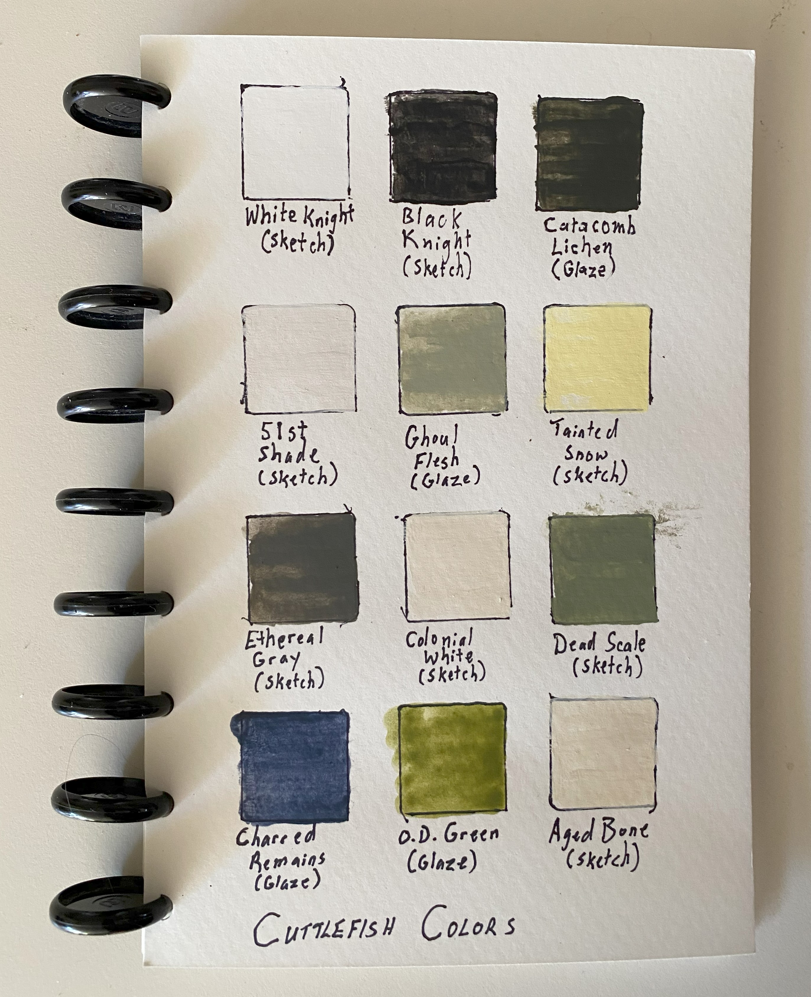
Another reason for creating swatches is to help you remember what colors look like. It doesn’t take long in this hobby to accumulate dozens if not hundreds of different paints. As a septuagenarian, it is sometimes hard to remember if an off-white color is a warm color (having a bit of yellow in it) or if it is a cool color (having a bit of blue in it). A swatch will instantly tell me that Vallejo’s Ivory is a warm off-white and Reaper’s Polished Bone is a cool off-white.
I’m replacing my old swatches with new swatches. My old swatches were little more than a wide line of color, the new swatches are 25mm squares to help the failing eyesight of a doddering old woman. In constructing the swatches, I painted them straight out of the bottle without thinning so I can tell the opaqueness and/or transparency of a paint before adding any thinning mediums. The swatches are painted on watercolor paper I got at Wal-Mart for six or seven dollars, cutting each sheet in half. Finally, I punch the paper pages and assemble them into a book.
I’ve also included a couple of pictures of a color wheel I use. These can be picked up at almost any arts and crafts store. This little tool helps a lot in quickly understanding how colors work together.


Oh, a fun bit of trivia for my male readers, my hair stylist who is well known for hair coloring keeps swatches of hair and nail colors.
Anyhoo, I thought I’d start the year with a look at a simple tool that helps my painting a bit easier and faster by choosing a good color scheme from the start. Let me know if you have a system for referencing paint colors.

As always, your comments and suggestions are greatly appreciated and never ignored unless they contain spam. (However, I do like Spam and keep a can in my pantry. It’s humorous that spam has become to mean something received in huge quantities to a point where it is unwelcome. This actually stems from a letter written by President Eisenhower: “During World War II, of course, I ate my share of Spam along with millions of other soldiers. I’ll even confess to a few unkind remarks about it—uttered during the strain of battle, you understand. But as former Commander-in-Chief, I believe I can still officially forgive you your only sin: sending us so much of it.”)
One final bit of trivia – when I started school, in front of the classroom above the blackboard were pictures of three Presidents, George Washington, Abraham Lincoln, and the current President, Dwight D. Eisenhower. Oh, and the flag above the pictures had only 48 stars. Ach! How did I get so old?
